Kaggle에 있는 Terrorist Attacks 데이터 셋으로 전처리 및 시각화를 해보겠습니다.
EDA 주제는 다음과 같습니다.
① 테러가 가장 많이 발생한 나라 TOP 10
② 테러 건수 세계 지도
③ 연도별 테러 건수 변화
④ 연도별 테러 수단
⑤ 테러리스트의 사망 원인
⑥ 사망자 연령 분포
⑦ 테러와 사망의 상관관계에 대한 t-test
먼저 위 주소에서 데이터를 다운로드한 후 Rstudio에서 csv 파일을 읽습니다.
setwd('C:\\Users\\32217778\\Downloads\\terrorist_attacks')
ds = read.csv('C:\\Users\\32217778\\Downloads\\terrorist_attacks\\terrorist_attacks.csv')

str(ds)  # 데이터 형식 확인

ds = subset(ds, ds$Entity != 'Africa' &
              ds$Entity != 'Europe' &
              ds$Entity != 'Asia' &
              ds$Entity != 'North America' &
              ds$Entity != 'South America' &
              ds$Entity != 'Oceania' &
              ds$Entity != 'Middle East & North Africa' &
              ds$Entity != 'South Asia' &
              ds$Entity != 'Western Europe' &
              ds$Entity != 'Eestern Europe' &
              ds$Entity != 'Southeast Asia' &
              ds$Entity != 'Sub-Saharan Africa' &
              ds$Entity != 'Central America & Caribbean' &
              ds$Entity != 'World')

table(is.na(ds))  # 결측치 없음
나라, 연도, 테러 수단, 피해 연령대, 테러리스트 사망 원인 등 21개 칼럼으로 이루어져 있습니다.
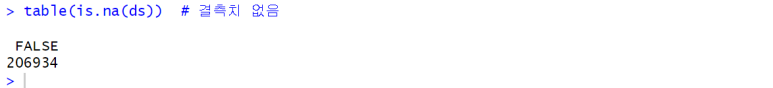
True 값이 없으므로 결측치가 없는 것을 알 수 있습니다.
다양한 결과를 도출하기 위해, 각 대륙의 속한 나라의 총계를 의미하는 대륙 칼럼들을 제외했습니다.
① 테러가 가장 많이 발생한 나라 TOP 10
library(dplyr)

tot_attack = ds %>%
  group_by(Entity) %>%
  summarise(Terrorist.attacks = sum(Terrorist.attacks)) %>%
  arrange(desc(Terrorist.attacks)) %>%
  slice_head(n = 10)

tot_attack
library(dplyr) : 파이프 연산자(%>%) 사용을 위해 dplyr 패키지를 로드합니다.
group_by(Entity) : 나라(Entity) 열을 기준으로 그룹화합니다.
summarise(Terrorist.attacks = sum(Terrorist.attacks)) : 각 그룹에 대해 Terrorist.attacks 열의 합계를 계산하여 새로운 열인 Terrorist.attacks 을 만듭니다.
arrange(desc(Terrorist.attacks)) : Terrorist.attacks 열을 기준으로 내림차순으로 데이터를 정렬합니다.
slice_head(n = 10) : 정렬된 데이터에서 상위 10개의 행을 선택합니다.
- 실행 결과

# ggplot을 사용한 시각화

library(ggplot2)

ggplot(tot_attack, aes(reorder(Entity, -Terrorist.attacks),
                       Terrorist.attacks, fill = Entity)) +
  geom_bar(stat = "identity") +
  labs(x = '', title = 'Top 10 most attacked Entity') +
  theme(legend.position = "none",
        axis.text.x = element_text(angle = 45, vjust = 0.5, hjust = 0.5))
ggplot(tot_attack, aes(reorder(Entity, -Terrorist.attacks), Terrorist.attacks, fill = Entity)) : ggplot 객체를 생성하고, x 축에는 'Entity'를 테러 공격 건수(Terrorist.attacks)을 기준으로 내림차순으로 정렬하여 나타내고, 막대의 색을 Entity에 따라 구분합니다.
geom_bar(stat = "identity") : 각 막대의 높이를 직접 지정한 값으로 사용합니다.
theme(legend.position = "none", axis.text.x = element_text(angle = 45, vjust = 0.5, hjust = 0.5)) : 범례를 표시하지 않도록 하고, x 축 레이블의 텍스트를 45도 기울여 표시하며, 텍스트의 위치를 조절합니다.
- 실행 결과

이라크, 아프가니스탄, 파키스탄, 인도 등 중동 지역 부근의 국가들이 테러 건수가 가장 많은 것을 알 수 있습니다.
② 테러 건수 세계 지도
library(tidyverse)

country = ds %>%
  group_by(Entity) %>%
  summarise('Terror' = sum(Terrorist.attacks))

country = data.frame(country)

world = map_data(map = 'world')
world = world %>%
  filter(region != 'Antarctica')
world = left_join(world, country, by = c('region' = 'Entity'))

world
ds %>% group_by(Entity) %>% summarise('Terror' = sum(Terrorist.attacks)) : Entity 열을 기준으로 그룹화하고, 각 그룹의 Terrorist.attacks 값을 합산하여 새로운 열인 Terror를 생성합니다.
country = data.frame(country) : list 형태의 country를 데이터 프레임으로 저장합니다. ( 후에 left_join 함수를 사용할 때 형식을 일치시키기 위해)
world = map_data(map = 'world') : 세계 지도 데이터를 불러옵니다.
world = world %>% filter(region != 'Antarctica') : 남극은 데이터가 없으므로 보기 좋은 지도를 그리기 위해 남극을 제외합니다.
world = left_join(world, country, by = c('region' = 'Entity')) : region 과 Entity 열을 기준으로 합칩니다.
- 실행 결과

ggplot(world, aes(x = long, y = lat, group = group)) +
  geom_polygon(aes(fill = Terror)) +
  scale_fill_gradient(low = "pink", high = "red", name = "Terror") +
  labs(x = 'Longitude', y = 'Latitude',
       title = 'The Number of Terrorist Attacks in the World')
ggplot(world, aes(x = long, y = lat, group = group)) : ggplot 객체를 생성하며, x축에는 경도(long), y 축에는 위도(lat), group을 기준으로 세계 지도를 그룹화합니다.
geom_polygon(aes(fill = Terror)) : 세계지도를 다각형으로 그리고, Terror 열을 기반으로 각 국가의 색상을 지정합니다.
scale_fill_gradient(low = "pink", high = "red", name = "Terror") : Terror 열 값에 따라 색상을 지정하는데, 낮은 값은 "pink", 높은 값은 "red"로 설정하고, 범례의 제목을 "Terror"로 설정합니다.
- 실행 결과

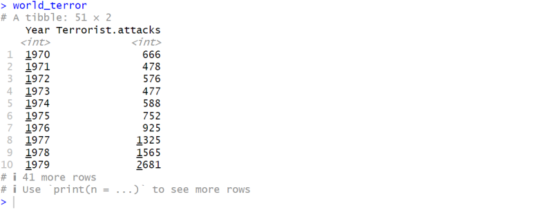
③ 연도별 테러 건수 변화
world_terror = ds %>%
  group_by(Year) %>%
  summarise(Terrorist.attacks = sum(Terrorist.attacks))

world_terror
- 실행 결과
ggplot(world_terror, aes(Year, Terrorist.attacks)) +
  geom_line(col = 'red', lwd = 1) +
  labs(x = '', title = 'Number of Terrorist Incidents by Year')
ggplot(world_terror, aes(Year, Terrorist.attacks)) : x 축은 Year, y 축은 Terrorist.attacks 열을 사용합니다.
geom_line(col = 'red', lwd = 1) : 선 색상은 빨강, 굵기는 1로 하여 선 그래프를 그립니다.
- 실행 결과

2010년부터 2014년 사이에 급증하다가, 그 이후로 급감하는 모습입니다.
④ 연도별 테러 수단
method = ds %>%
  group_by(Year) %>%
  summarise(Hijacking = sum(Attack.method..Hijacking),
            Hostage.Taking..Barricade.Incident = sum(Attack.method..Hostage.Taking..Barricade.Incident.),
            Unarmed.Assault = sum(Attack.method..Unarmed.Assault),
            Facility.Infrastructure.Attack = sum(Attack.method..Facility.Infrastructure.Attack),
            Hostage.Taking..Kidnapping = sum(Attack.method..Hostage.Taking..Kidnapping.),
            Assassination = sum(Attack.method..Assassination),
            Armed.Assault = sum(Attack.method..Armed.Assault),
            Bombing.Explosion = sum(Attack.method..Bombing.Explosion))

a = ggplot(method, aes(x = Year, y = Hijacking, fill = Year)) +
      geom_bar(stat = "identity") +
      labs(x = '', title = 'Attack.method..Hijacking') +
      theme(legend.position = 'none')

b = ggplot(method, aes(x = Year, y = Hostage.Taking..Barricade.Incident, fill = Year)) +
      geom_bar(stat = "identity") +
      labs(x = '', title = 'Hostage.Taking..Barricade.Incident') +
      theme(legend.position = 'none')

c = ggplot(method, aes(x = Year, y = Unarmed.Assault, fill = Year)) +
      geom_bar(stat = "identity") +
      labs(x = '', title = 'Unarmed.Assault') +
      theme(legend.position = 'none')

d = ggplot(method, aes(x = Year, y = Facility.Infrastructure.Attack, fill = Year)) +
      geom_bar(stat = "identity") +
      labs(x = '', title = 'Facility.Infrastructure.Attack') +
      theme(legend.position = 'none')

e = ggplot(method, aes(x = Year, y = Hostage.Taking..Kidnapping, fill = Year)) +
      geom_bar(stat = "identity") +
      labs(x = '', title = 'Hostage.Taking..Kidnapping') +
      theme(legend.position = 'none')

f = ggplot(method, aes(x = Year, y = Assassination, fill = Year)) +
      geom_bar(stat = "identity") +
      labs(x = '', title = 'Assassination') +
      theme(legend.position = 'none')

g = ggplot(method, aes(x = Year, y = Armed.Assault, fill = Year)) +
      geom_bar(stat = "identity") +
      labs(x = '', title = 'Armed.Assault') +
      theme(legend.position = 'none')

h = ggplot(method, aes(x = Year, y = Bombing.Explosion, fill = Year)) +
      geom_bar(stat = "identity") +
      labs(x = '', title = 'Bombing.Explosion') +
      theme(legend.position = 'none')

library(cowplot) # install.packages('cowplot')

plot_grid(a,b,c,d)
plot_grid(e,f,g,h)
method : ds 데이터를 연도별로 그룹화하고 각 공격 유형에 대한 합계를 계산한 결과입니다.
a ~ h : 각각의 공격 유형에 대한 막대그래프를 작성합니다.
plot_grid : 각 그래프들을 격자 형태로 배열합니다.
- 실행 결과


⑤ 테러리스트의 사망 원인
death.type = data.frame(Suicide = ds$Terrorist.Death.Type...Suicide,
                        Killed = ds$Terrorist.Death.Type...Killed)
tot_type = colSums(death.type)
ratio_type = (tot_type / sum(tot_type)) * 100

ratio_type
death.type : ds의 두 열을 추출하여 새로운 데이터 프레임을 생성합니다.
tot_type : death.type 데이터 프레임의 열별 합계를 구합니다.
ratio_type : 합이 100이 되도록 백분율로 변환합니다.
- 실행 결과

pie(ratio_type,
    main = 'Terrorist Death Type',
    radius = 1,
    col = c('red', 'skyblue'),
    labels = paste(names(ratio_type), round(ratio_type), '%'))
- 실행 결과

⑥ 사망자 연령 분포
library(tidyr) # install.packages('tidyr')

death_age = ds %>%
  group_by(Year) %>%
  summarise('100 ~' = sum(Death.Age.100.),
            '51 ~ 99' = sum(Death.Age..51.99),
            '21 ~ 50' = sum(Death.Age...21.50),
            '11 ~ 20' = sum(Death.Age...11.20),
            '1 ~ 5' = sum(Death.Age....1.5)) %>%
  pivot_longer(cols = c('100 ~',
                        '51 ~ 99',
                        '21 ~ 50',
                        '11 ~ 20',
                        '1 ~ 5'))

colnames(death_age) = c('Year', 'Age', 'value')
death_age$Age = factor(death_age$Age,
                       levels = c('1 ~ 5', '11 ~ 20',
                                  '21 ~ 50', '51 ~ 99', '100 ~'))

death_age
death_age : Year 열을 기준으로 그룹화하고, 각 나이대 별로 합계를 계산합니다.
pivot_longer : 넓은 형식의 데이터를 좁은 형식으로 변환합니다. 연령대 칼럼들을 길게 늘어뜨려 새로운 열을 만듭니다.
- 실행 결과

ggplot(death_age, aes(x = Year, y = value, col = Age)) +
  geom_line(lwd = 0.7) +
  labs(x = '', y = '',
       title = 'Total Death of different age people in different year')
- 실행 결과

전 구간에서 1 ~ 5 세의 영아 사망자가 가장 많은 것을 알 수 있습니다.
⑦ 테러와 사망의 상관관계에 대한 t-test
cor.test(ds$Terrorist.attacks, ds$Terrorism.deaths)
- 실행 결과

- 해석
- 상관계수는 -1에서 1까지의 값을 가지며 0에 가까울수록 두 변수의 선형 관계가 약하다는 것을 의미합니다. 여기서 cor = 0.8619653 이므로 매우 강한 양의 선형 관계를 나타냅니다.
- t-통계량(t-statistic) = 168.76 : t-통계량이 클수록 표본의 크기에 비해 효과가 크며, 이는 통계적으로 유의미한 결과를 나타냅니다.
- df(자유도) = 9852 : n - 2 (왜 n, n - 1이 아니라 n - 2인지는 깊은 통계적 접근이 필요)
- ★ p-값(p-value) < 2.2e-16 : p-value는 가설검정 시 귀무가설을 채택/기각할 때 주로 사용됩니다.
- alternative hypothesis: true correlation is not equal to 0 : 대립가설은 두 변수 간의 상관계수가 0이 아니라고 주장합니다.
- 신뢰구간(confidence interval) : 상관계수의 추정 값에 대한 구간입니다. 95%의 신뢰수준에서 신뢰구간은 0.8568027에서 0.8669551까지이고, 이는 신뢰수준 내에서 상관계수가 존재할 가능성이 높다는 것을 의미합니다.
- t-test의 자세한 해석은 통계학 포스팅에서 다루겠습니다.
'R' 카테고리의 다른 글
| [R] 다변량 자료 분석 (2) : Hotelling T^2 검정 (2) | 2024.03.21 |
|---|---|
| [R] 다변량 자료 분석 (1) : airquality 데이터 산점도 (0) | 2024.03.21 |
| [R] 데이터 전처리 및 시각화 (4) (0) | 2024.02.23 |
| [R] 데이터 전처리 및 시각화 (3) (0) | 2024.01.23 |
| [R] 데이터 전처리 및 시각화 (1) (1) | 2024.01.23 |


